When choosing front door colors for red brick house styles, you’ll need to take into account a few things. What sort of trim is already in place on your home? What color and material is your roof? How will it fit in with your landscaping and other decor? I know a lot goes into choosing the right color for your front door. This is especially true if you have natural wood siding! That’s why I’ve put this list together for you.
Front Door Colors For Red Brick House
1. Making A Splash
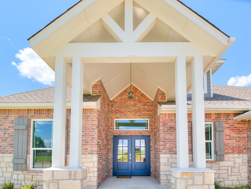
If you have a house that follows a more neutral color palette, you might want to add a splash of color to keep it from looking washed out. In this case, the color you choose for your front door is going to set the mood for the entire exterior of the house. If you go with red, it’s going to have a hotter, more excited look. Green makes it more earthy. Or, as this homeowner chose, blue makes it cooler and more tranquil.
2. Regal Brick Manor
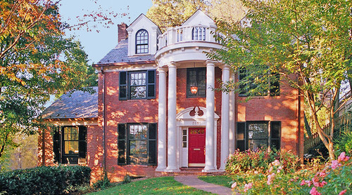
Now what if your home’s brick face has a little more heat to the bricks? If there’s more red or orange to them than the last house, then choosing a hotter color can pull it all together. Matching the red of the bricks doesn’t have to be precise. As you can see here, the homeowner chose a brighter red than the rest of the house. This stands out well against the white trim of the painted wood, giving it a bold and regal air.
3. Aquatic Forest
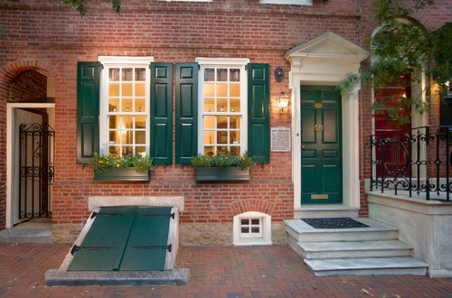
Maybe you have medium-toned bricks, not quite light and not quite dark. This is a great position to be in, as you can decide whether you want to go with a brighter or darker atmosphere. In this case, the homeowner chose to play both sides of the field. The blue-green shade of the front door and shutters gives it a forest-like quality. But it’s a bit on the watery side, which blends well with the wide window sashes. The plants in the window boxes completes the look with unprecedented precision.
4. Cobalt Retreat
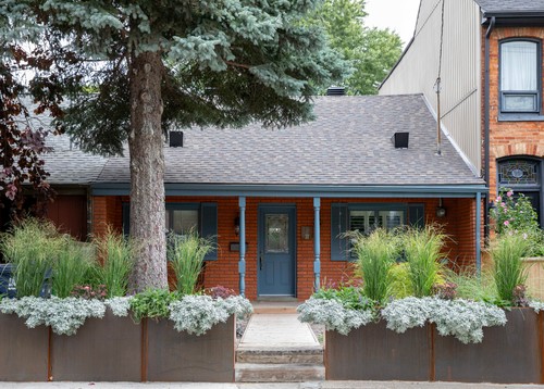
This homeowner has a more vibrant shade of red-orange bricks with little mortar to offer relief from the hue. Their roof is a dark gray asphalt, so a bolder color won’t work well against it. So they chose a cobalt blue for their front door and trim, which was genius! They took a little of the gray from their asphalt roof and combined it with a cool color to offset the hotter shade of bricks. The effect is a dramatically calmer-looking house. Red or black would have only turned the heat up even more!
5. Variety House

They say variety is the spice of life. When it comes to home decor, though, mixing colors can be hit or miss. How do you blend black, white, green, and red into one satisfying look? This homeowner’s brick home has black and white bricks nestled between their other various shades of red bricks. They used black for their gutters and white trim for their porch and windows to close the tricky divide. Then they chose a red door with a black outline to pull it all together!
6. Doily Home

This house reminds me of a generic grandparents’ coffee table—and I say that with affection. The white vergeboard is so intricate and detailed, it could be lace curtains at first glance. The bricks of this home are on the darker side with thin lines of uniform mortar.
This gives it a precise and dignified look, complementing the vergeboard. The homeowner makes the excellent choice to maintain continuity with a white front door. Any other color would distract from that gorgeous woodwork!
7. In Shadow
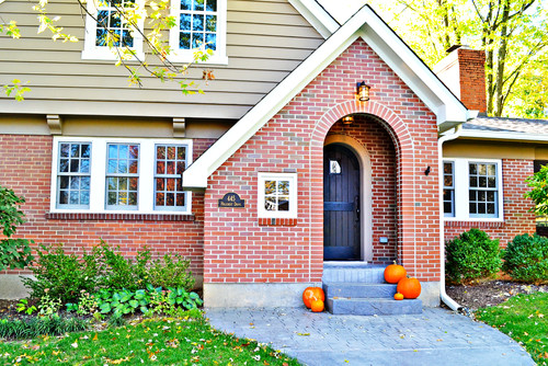
Now this is an interesting choice for a front door color. If you’ll notice, some of the bricks in this home are a faded blue-gray. The homeowner’s choice of a grayish navy color for the front door brings out the subtle blue in these old bricks.
If they chose black for the door, then it would overpower these few bricks and I would assume they were black all along. In addition to this, the darker color intensifies the shadow of the recessed front entry, giving it a more mysterious vibe.
8. Dark Pastel
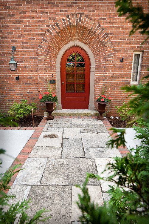
When I think of pastel colors, I think of the soft yellows and greens of old paintings. Pastels are light, subdued, and communicate a sense of tranquility. They’re the hues you remember from a dream when you wake. But looking at the color this homeowner chose for their front door made me realize pastels can be dark, too. This dark red would typically give the house a harsh, imposing expression. But there’s a softness to it that blends the surrounding bricks with the door. This house is peaceful, but commands our respect.
9. Charcoal Estate

This is another building of dark red brick with thin, uniform lines of mortar. As I’ve mentioned before, this gives the immediate impression of a regal, respectable home. The color the homeowner chooses for their trim and front door are paramount to set the underlying mood.
Here, they’ve chosen a subdued black instead of a stark, full-on void of the shade. This gives it a softer feeling, but without losing the seriousness of the structure. This building says, “I am all-business.”
10. Rustic & Timeless

Older brick structures always give me pause. I usually stop and stare at them for awhile, wondering what stories they remember. What sort of people once lived within their walls? But the thing about old—really old—brick buildings, is that the mortar tends to crumble. The bricks chip and crack under the relentless barrage of the elements over the decades.
This homeowner chose a barn-door style, giving the home an idyllic air. It complements its age instead of drawing focus to the slight disrepair. The splash of pastel green paired with the charcoal trim both blends with the brick and draws the eye of passerby.
11. Permanent Overcast

This house has a permanently overcast look to it. The large patch of white siding coupled with the stonewashed colors of the bricks exacerbates this condition. The black trim darkens it even further, giving this house an overall feeling of a 19th century manor atop a windy moor.
The homeowner’s solution was to choose a brighter color for the front door, settling on a sky blue that almost matches the water of the nearby pool. This color reminds me of a gap in the clouds, the promise of sunny skies ahead.
12. A Complement of Opposites

This house’s bricks use a lighter stone for the trim and a darker stone for the body. This gives it a distinct outlined look and helps brighten the home’s exterior. Almost any color the homeowner chose would’ve looked a bit out of place, so naturally they chose two.
The dual-toned maroon and salmon follow the reverse of the lighter and darker stone. The maroon outlines the interior of the door, while the salmon makes up the majority. This keeps the entryway from looking too gloomy or disappearing into the shadows.
13. Creamy Elegance

The bricks of this home are more orange than red, perhaps even more yellow than orange. The homeowner chose to use a cream-white shade for the window sashes and supports. This brings out more of the yellow hues in the brick and brightens the look.
To keep it from coming off as too cheery or whimsical, they chose a black door to match the shutters. This helps define its personality as a welcoming yet distinguished home.
14. Pairing With Landscape

A lot of homeowners focus on the color scheme of their house when choosing a color for their brick home. They try to match it to the roof or the trim. But the gray and white and light brown of this home already gave it a more washed out look than most.
Instead of focusing on blending the front door with their home, they paired it with their landscape and went with a vibrant green. This draws the eye first to the doors, then to the front lawn, and finally to the house. It also helps connect the structure with the land.
15. Scarlet & Gray
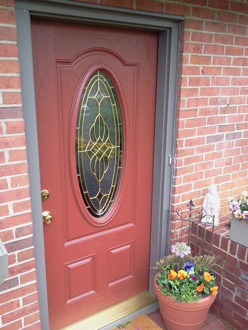
The dull red of this door paired with the gray door frame gives this entryway a look that’s both quiet and loud. Trying to match the medium-temperature bricks of this home must have been a challenge. The homeowner decided on a shade that somewhat matched the bricks, but also raised the ‘volume’ of them. The gold threshold and hardware of the door adds just enough glitz to keep it from becoming too gloomy.
16. Look Here!

Anytime you want to make something the focus of attention, make it different from its surroundings. It’s a simple rule and one this homeowner used well. The entry of this home is dead center, which means that making it the focus also adds balance to the rest of the home.
There’s a symmetry to it that’s enhanced by passersby’s eye drawing to the door first. The rest of this home is dark brick, so a medium shade of blue or red or green helps the door stand out.
17. Au Naturale

Sometimes the best color paint for your front door is none at all. For this home, the owner opted to forgo Sherwin Williams and use a light stain for their oak front door. This pairs well with the wide, white mortar between the vibrant red bricks. It gives the impression of a warm cottage, the scent of fresh stew filling the air. This home is welcoming and comforting.
18. Red Grain

Maybe you really like the bold choice of a red front door, but you also want the rustic feeling of a natural wood. If that’s the case, wait until I tell you about red stain. Really, though, this homeowner found the perfect compromise for their brick home.
The red of the stone isn’t consistent and uniform and there’s gray blocks among them, as well. This means that a solid color for their front door would look out of place. Using a natural wood with a deep red stain means that they get that same textured coloring as their bricks.
19. Hidden Pine

We haven’t seen a lot of homeowners on this list who tried to erase their door, but I believe that was this person’s intention. It’s easy to overlook the natural pine wood entry, even though it’s quite a large door. I believe the purpose of this was to force the eye to see the home in its entirety. Rather than assigning any one aspect of the home as the focus, it allows viewers to see the home as a whole at first glance.
20. Brick Accent
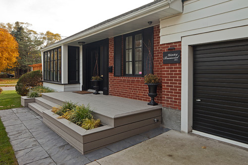
Perhaps your home doesn’t have a lot of exposed brick, but you’d like to make that the centerpiece of your home. The easiest way to do that is to make the rest of your house as little brick-like and attention-grabbing as possible. This homeowner highlights their bright red bricks with wide, white mortar by using a heavy black for the trim and shutters. Then, to keep it from looking too dark, they paint the porch a light, unassuming gray. The first place your eyes look is the bricks.
21. Winter Morning
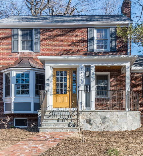
Cobalt blue is a certain shade of sky you only see on sunny winter days, so this homeowner chose the perfect color to pair with it. On any other home, other than brick, I don’t think it would look as nice. But here, alongside white trim and bricks of various shades, it makes everything pop.
The homeowner chose a pastel yellow for the door, the exact hue of the subdued winter sun. This reminds me of chilly mornings on my front porch, sipping coffee as I wait for the migrating birds to return.
22. Stately Wood

Here, we see a homeowner who decided that continuity was in order. Rather than try to match the color of their front door with their bricks or pair it with the white pillars, they opted for wood. The wood of their porch’s ceiling makes this work best, even if it is a different stain than the door.
The darker stain of the ceiling keeps it out of initial focus, directing viewers to first enjoy the brick facade of the home. The brightest color here is the brick, ensuring that it remains the centerpiece.
23. Golden Fairytale

Part of the allure of this front door are the wrought-iron volutes forming a web over the glass. If the homeowner chose a darker color, this breathtaking design would all but fade into the background. Instead, they chose a smart golden pine stain.
Using a darker stain around the edges gave the door dimension and texture. The result is an entryway that feels alive and magical. It goes well with the light yellow stones of the front entry’s atrium and sets it all apart from the red brick backdrop.
Conclusion
Did you enjoy this list? I felt I needed to put this list together, because I realized how many ways a house can transform based on its front door. The different shades and textures and palettes have so much power over your home’s personality, it’s astounding.
What did you think of this list? Did you get any ideas for your own home? Leave me a comment down below, if this list was interesting to you. And feel free to share, if you liked my list.
Our house has a red brick front with siding on the rest.We just had a new roof put on and next spring we’re doing the siding. I’ve been stuck on colors. We’ve moved from blue inside to gray and #15 has decided it for me. It will be perfect! So happy to find this site.